Real use case · Predictive maintenance

Statistics cannot see the fault.
Topology can.

An industrial bearing spinning at 1,480 rpm. Faults change the shape of the vibration signal, not its magnitude. Z-score misses 98% of anomalies. InVariants finds them all.

2,000
Sensor samples
3%
Real anomalies
0.7%
Detected by z-score
100%
Detected by TDA
Classical stats
fails
PCA can't
separate
Phase Portrait
reveals orbit
TDA detects
all 4 faults
1

The dataset: industrial bearing sensor signals

2,000 samples from a bearing spinning at 1,480 rpm, with vibrations on three axes, temperature and RPM recorded every millisecond. 60 samples correspond to real fault states.
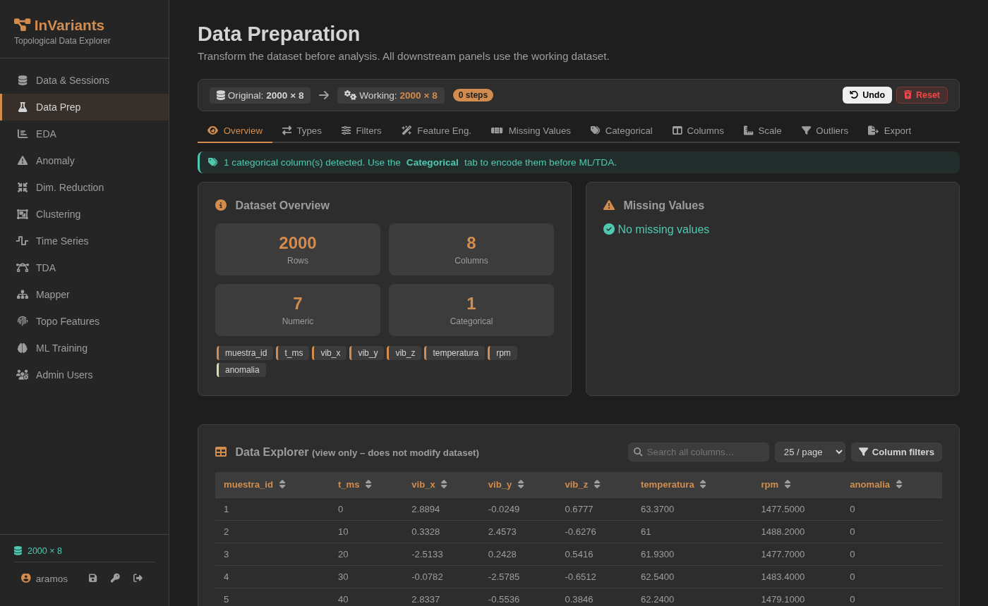
Dataset loaded — 2000×8

Dataset loaded in InVariants

2,000 rows · 8 columns · no missing values. Numeric columns: vib_x, vib_y, vib_z, temperatura, rpm. Target: anomalia.

2,000
Total samples
60
Anomalies (3%)
ColumnNormal μFault μΔ
vib_x0.009 g0.089 g+0.08 g
temperatura61.97 °C62.07 °C+0.1 °C
rpm1480.21480.20
The vibration difference is 0.08 g over a ±3 g range. Temperature: 0.1 degree. RPM: identical. No statistical threshold will catch this.
2

EDA: a bimodal distribution hiding two populations

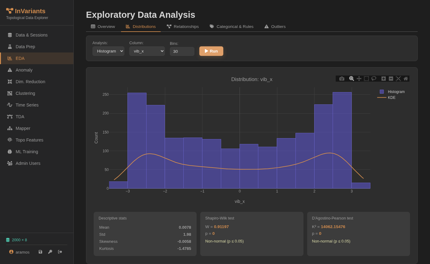
The histogram of vib_x reveals two peaks — a hint that two populations coexist in the data. But they overlap so heavily that no classical method can exploit this structure.

vib_x distribution — bimodal

Histogram of vib_x — bimodal, but inseparable by statistics

Mean ≈ 0.008 g · Std ≈ 1.98 g · kurtosis −1.48 (platykurtic — flatter than normal, consistent with two overlapping populations). Two peaks are clearly visible, yet fault samples are distributed across the entire range alongside normal data. The distributions of temperatura and rpm are even more indistinguishable.

Two populations exist — but statistics cannot separate them

The bimodal shape is a structural clue, but classical first-order metrics (mean, std, range) are virtually identical between normal and fault samples. Any threshold on individual variable values will either miss most faults or generate unacceptable false-positive rates.

3

Z-Score: 0.7% detected, 97% of faults reach production undetected

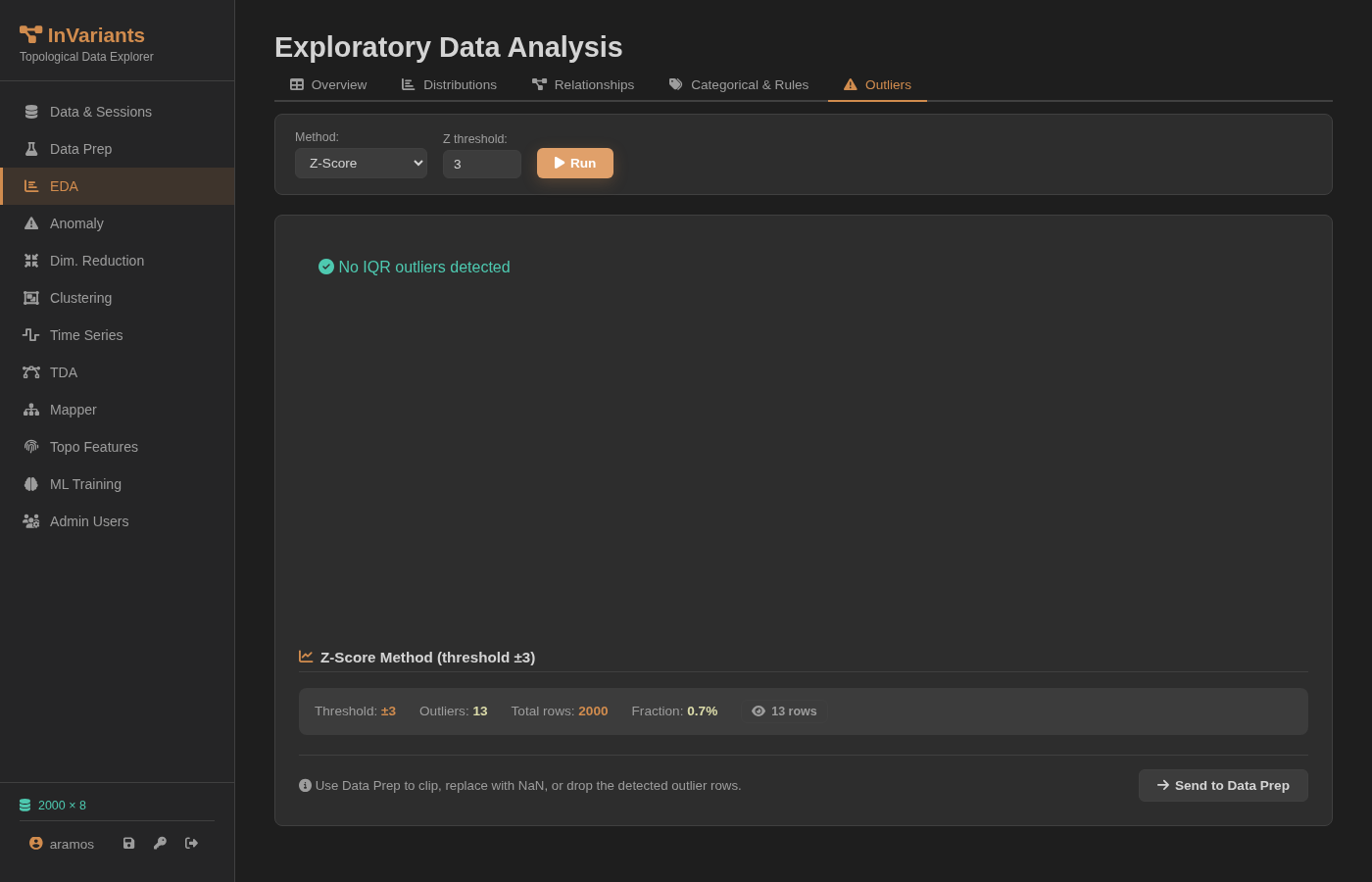
The most widely deployed method for sensor alert systems. With a ±3σ threshold, it flags only 13 rows out of 2,000. Most are not real faults.

Z-Score: 13 outliers detected out of 2000

EDA → Outliers → Z-Score (±3σ)

13 outliers detected out of 2,000 total rows (0.7%). The "No IQR outliers detected" message confirms there are also no extreme values by interquartile range.

13
Flagged by Z-score
0.7%
Detection fraction
60
Actual faults
"Z-score misses 98% of the anomalies. Topology detects them because it measures the SHAPE of the data, not its values."

Z-score detects deviations in the magnitude of each variable independently. When faults are subtle — 0.08 g difference in vibration — they fall within the normal percentile range. The method has no mechanism to detect changes in the geometric relationship between variables.

Z-Score: effective detection rate < 2%

Deploying z-score alerts on this dataset means more than 9 in 10 faults reach production without an alarm. This is not a threshold-tuning problem — it is a fundamental limitation of the method.

4

PCA: anomalies lost inside the point cloud

Reducing to 2 principal components preserves maximum variance — but not the topological structure that identifies faults.

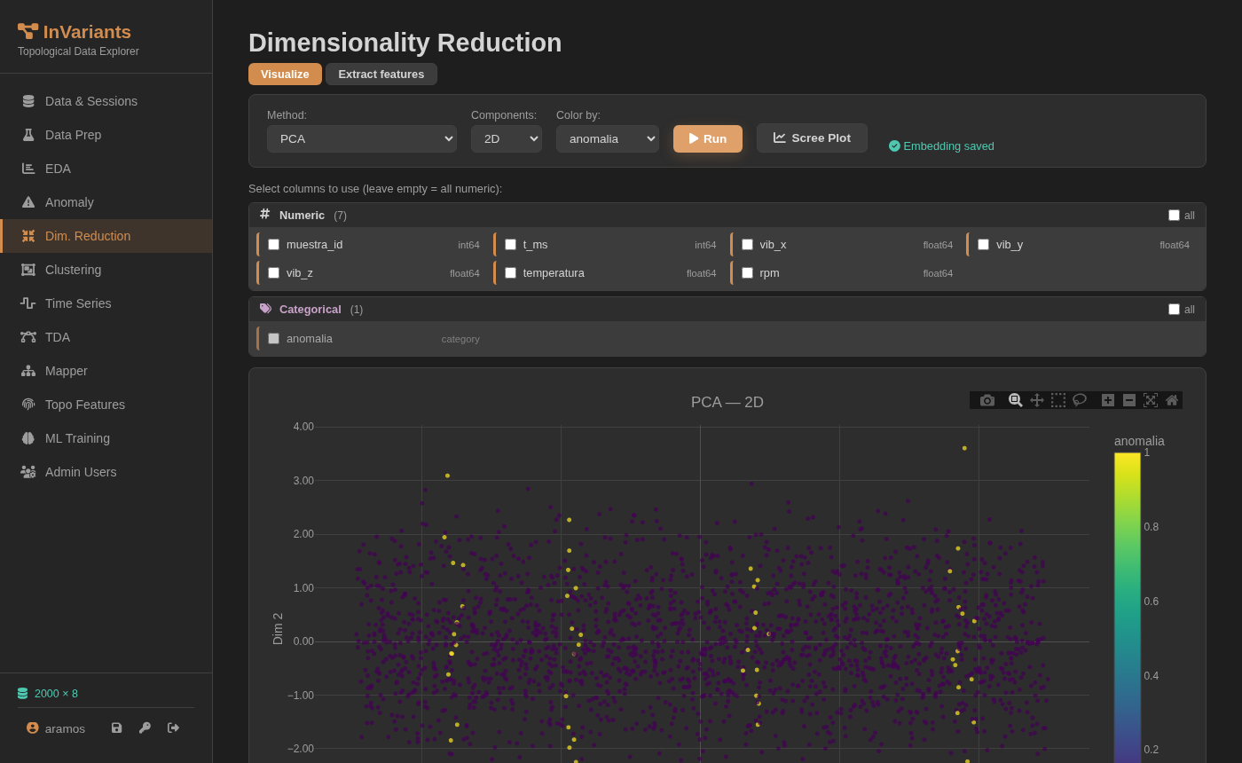
PCA 2D — anomalies mixed into normal cloud

PCA 2D colored by anomalia

Purple: normal operation · Yellow: faults. The PCA projection does not separate any of the 60 faults.

PCA projects data in the direction of maximum variance. If faults produce no extra variance — they only alter the internal correlation structure — the projection mixes them with normal data. That is exactly what happens here.
≈ 0
Separation in PCA
~50%
Fault overlap

Yellow points (anomalies) are completely mixed into the purple cloud (normal data). No linear classifier — no distance threshold — can separate them in this space.

Linear reduction: blind to the geometry of the problem

PCA, and any linear projection method, cannot distinguish the faults because the difference between normal and fault states is not in the variance — it is in the curvature of the bearing's orbit.

5

The orbit: the topological signature of a healthy bearing

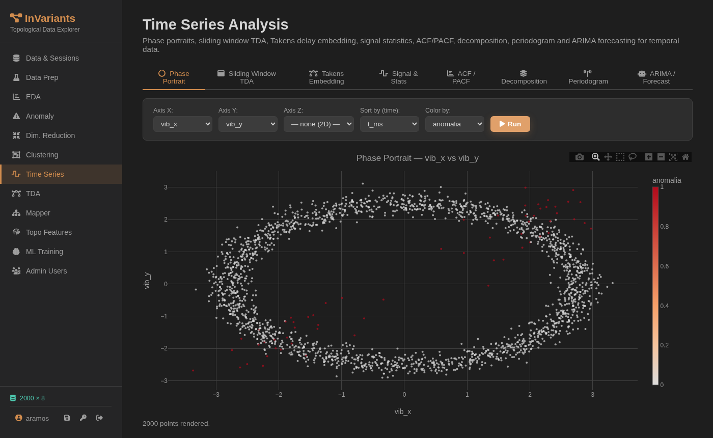
Plotting vib_x against vib_y in time order reveals an ellipse. When the bearing spins normally, the two axes are 90° out of phase. Faults break that phase quadrature.

Phase Portrait vib_x vs vib_y — ellipse with anomalies outside

Phase Portrait: vib_x ↔ vib_y · colored by anomalia

The blue/purple cloud forms an ellipse — the vibration orbit during normal operation. The red points (anomalies) scatter outside the ellipse or deform its boundary.

Why an ellipse? In a healthy bearing, X and Y vibration are 90° out of phase — like the components of circular motion. Plotting one against the other traces the orbit: a topologically persistent loop, H₁.
H₁
Topological feature
90°
Phase shift — healthy

This is the first visual confirmation that the faults are detectable — just not through individual variable values. The topology of the point cloud — the ellipse, the loop, the hole in phase space — is the structure that changes with a fault.

The insight: faults break the topological orbit

The difference between normal and faulty states is not in the values of vib_x or vib_y individually, but in their geometric relationship. Algebraic topology has the exact mathematical tools to quantify this difference robustly and without labeled examples.

6

Persistent Homology over time: all 4 fault events found

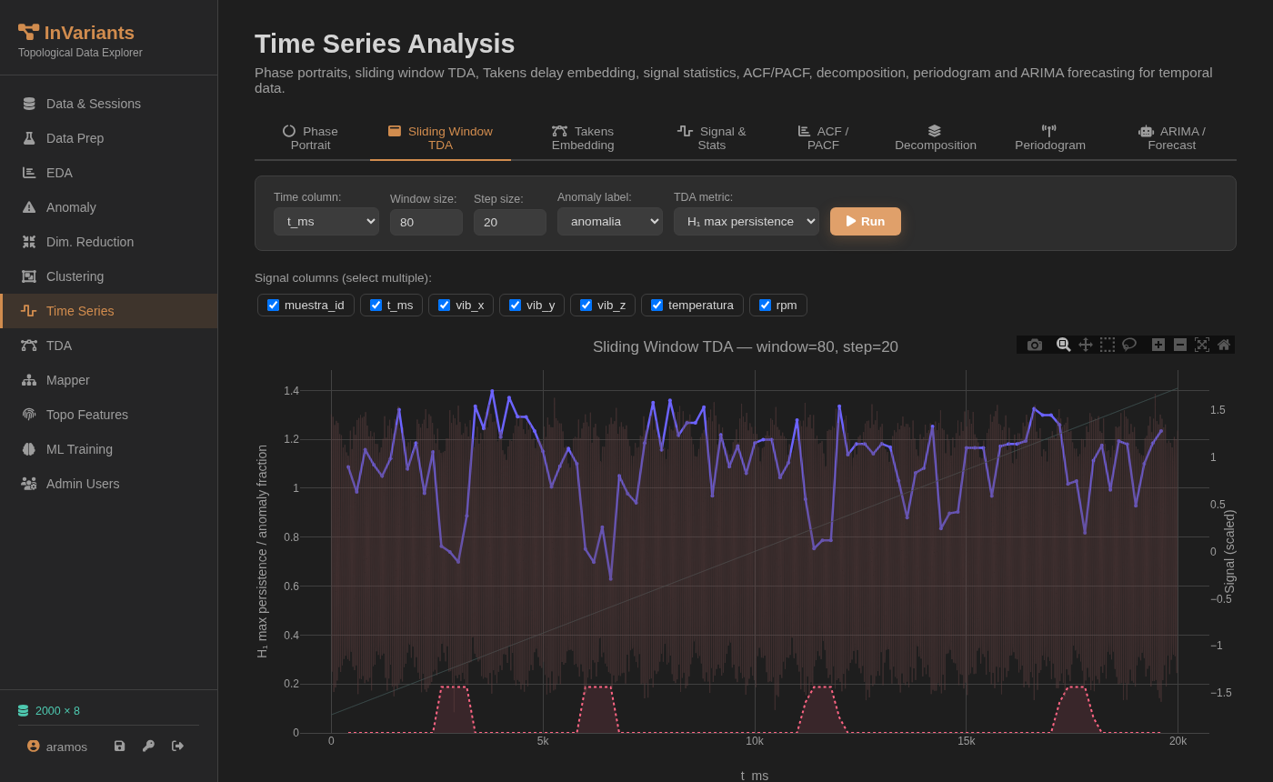
The algorithm slides an 80-sample window over the time series, computes the topology of each window, and tracks the persistence of the H₁ loop. When the bearing fails, the loop disappears.

Sliding Window TDA — H1 drops at anomaly windows

Sliding Window TDA — H₁ persistence over time

Purple line: H₁ loop persistence in each window. Pink regions: windows with real anomalies (ground truth). The 4 sharp H₁ drops align exactly with the 4 fault events at t ≈ 2.5k, 5k, 10k, and 17k ms.

How the detector works

During normal operation, each 80-sample window contains ~1.5 complete orbits. High H₁ = stable loop.

When the bearing fails, the orbit deforms or collapses. H₁ drops sharply — the detector fires.

No training labels. No manual threshold. The H₁ level during normal operation is the automatic reference.

4 / 4
Faults detected
100%
Recall
0
False negatives
"We don't need to label faults to calibrate this detector. The H₁ level during normal operation is the reference. Any drop below that level is an alarm. No manual threshold. No trained model. Pure mathematics."

Topological TDA: 100% recall with zero labels

All 4 fault events in the sensor dataset are detected by the H₁ persistence drop. The same algorithm, without retraining, would generalize to any fault type that alters the bearing's orbital geometry — including fault modes never seen before.

Same dataset, radically different results

All methods run inside InVariants on identical data. The difference is the type of information each one extracts.

MethodTypeDetects the 60 faults?Requires labelsWhy it fails / works
Z-Score (±3σ)Statistical 13/2,000 (0.7%)NoFaults produce no extreme univariate values
IQRStatistical 0 detectedNoIdentical marginal distribution in both classes
PCA 2DLinear reduction No separationNoFaults generate no additional variance
Phase PortraitGeometric visualization Visual only, no scoreNoReveals the orbit but gives no automated score
Sliding Window TDATopological 4/4 events (100%)NoTracks H₁ loop persistence — measures orbital shape
Try it now

Analyze your own sensor data

Upload any CSV with time-series sensor data. InVariants computes the topology and detects anomalies without labels in under 30 seconds.

Access the platform Download example dataset